Page 1 of 2
Club Logo??
Posted: Wed Jan 24, 2007 8:49 am
by Mystery Machine
Following on from
THIS thread, I've had a quick play (literally 5mins) and come up with this:
I'm not saying for one minute that anyone will like it, but it is just a starting point to get you thinking or considering what might work as a logo!

Things to think about:
Colour Scheme?
More 'graphic logo' or 'font logo'?
Do you want a combination of both?
What wording do you want? (keep it simple for the 'logo' itself - URL's etc...can be added after)
Think about lots of famous logos.....what makes them successful?? - simplicity is the key! :D
Possibly have two elements in mind: The word (i.e. NIKE) and the graphic (i.e. the Nike SWOOSH)
Sometimes just the word works well (i.e. Sony)
Sometimes just the logo works well (i.e. prancing horse for Ferrari)
Ultimately, the logo should work well in single colour as well as two colours. (any more and it starts getting fussy and expensive to reproduce...
)
The logo above, for example, could be made one colour just as eaasily (will give example if you want, but must dash out now......back later...... :lol: )
Just start with some feedback and we'll take it from there...
Regards,
Bruce.
Posted: Wed Jan 24, 2007 9:09 am
by mark
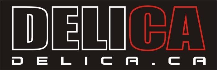
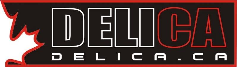
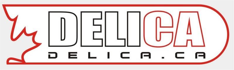
Bruce -- Awesome logo! (Especially considering this is your first draft!)
I really do like how the "CA" really stands out in red.
Another possible idea for emphasise the Canadian content would be to reverse the black & white color scheme (i.e., have all lettering in black on a white background), and to place a red maple leaf behind the "CA").
I'm also wondering if the spacing for the lower lettering "DELICA.CA" ought to be tightened-up (perhaps by altering this to "
WWW.DELICA.CA".
The above is intended for "brainstorming" -- on an overall basis I truly love what you've come up with!
I also hope you're OK with my taking the libererty to replace my current "Merry X-Mas!" logo (well beyond its shelf life now) with your new design!
Cheers, and many thanks,
Mark
Posted: Wed Jan 24, 2007 9:52 am
by Mystery Machine
Hi Mark,
Many thanks for the kind comments - I just hope I'm not treading on anyone's toes by doing this?? (as a non-canadian so to speak?

)
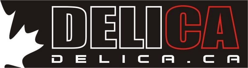
Funny you should mention the maple leaf - I was just finishing this when you posted:
But I'll have a play with what you said as well....
Back soon..... :D
regards,
Bruce.
Posted: Wed Jan 24, 2007 9:57 am
by mark
Wow! I love your second design even better. Awesome job Bruce.
Posted: Wed Jan 24, 2007 10:06 am
by Mystery Machine
P.S. It doesn't work too well on here because of the blue background of the forum! :(
I'll play with the URL as a seperate issue later, but concentrate on the main logo for now (if you don't mind me playing??)
There is always something like this too:
Posted: Wed Jan 24, 2007 10:14 am
by mark
Of your latest designs, #3 is my own personal preference (although graphic design has never been my strong suite).
This would make a good subject for a membership poll (once you're finished "playing").
:D
Mark
Posted: Wed Jan 24, 2007 10:33 am
by Mystery Machine
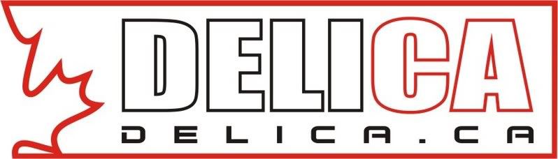
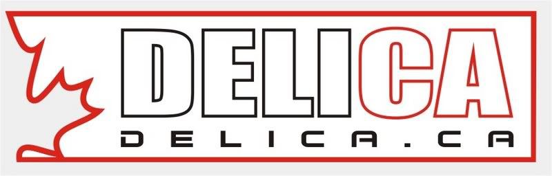
All the above designs with the maple leaf 'cut out' (i.e. not the solid red one) should look more like this:
WHITE background
BLACK background
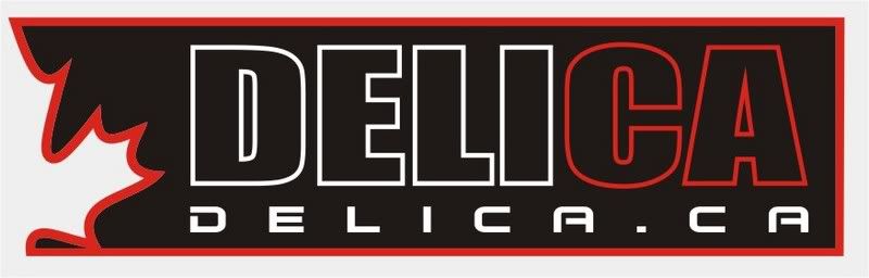
In the two above I've added the correct hex colour of the forum to the background to give it the proper 'cut out' look...
Right - now to have a play with your idea Mark.... 8)
Bruce.
Posted: Wed Jan 24, 2007 10:49 am
by Kuan
Hey Bruce,
Nice work. Looking sharp. Couple of comments.
1. Not sure if I am crazy about the main DELICA font. Seems a bit fat.
2. How about curving out the right hand edge so its not so boxy. It might look good contrasted to the jagged maple and give a bit more white space on the right.
Just ideas. I know its a lot of work, creativity and your free time.
Cheers mate.
Kuan
Posted: Wed Jan 24, 2007 10:55 am
by Mystery Machine
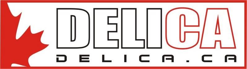
mark wrote:Another possible idea for emphasise the Canadian content would be to reverse the black & white color scheme (i.e., have all lettering in black on a white background), and to place a red maple leaf behind the "CA").
Do you mean something like this:
WHITE version

BLACK version
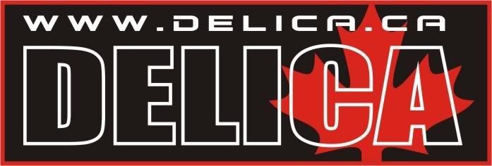
I've played with the URL too - you're right....it works better....
I'll wait for more comments and feedback (please be as critical as you like - this is YOUR logo people.....not mine so the more feedback I get the more happy you'll be with your logo!
)
Regards,
Bruce.
Logo
Posted: Wed Jan 24, 2007 10:58 am
by Pete and Jackie
Black background, Perfect. Is there anyway we can have it wrapped in a rolling paper? I see T-shirts, yaa baby, bumper stickers to stick on those sivil servants' rides, oooya, How about Delica Surfboards and Snowboards? If we can't beat the buerocracy, we'll smoke 'em with a wave of popularity.
Try the new "Delica Beer" Our bottles are larger on the inside, giving you a longer more unpredictable thirst quenching experience! Prices may vary.
Posted: Wed Jan 24, 2007 11:09 am
by Mystery Machine
Kuan wrote:1. Not sure if I am crazy about the main DELICA font. Seems a bit fat.
No probs - as mentioned, the more feedback you can give, the more I can tweak it...
Any suggestions for fonts??
Kuan wrote:2. How about curving out the right hand edge so its not so boxy. It might look good contrasted to the jagged maple and give a bit more white space on the right.
Do you mean something like this:
Let me know and keep that feedback coming.... :D
Regards,
Bruce.
logo
Posted: Wed Jan 24, 2007 11:36 am
by Pete and Jackie
Now we're getting there! nice fat round end
Posted: Wed Jan 24, 2007 11:44 am
by Kuan
if you are going to make a Delica Beer you'll need special bottles with crystal lite windows down the side.
Oh and don't forget to make the bottles leak for authenticity!
Liking the round end Bruce. How about the black background for comparison?
Are you working in Photoshop Bruce? Perhaps you could send me the file so I can play with a couple fonts.
Kuan
Posted: Wed Jan 24, 2007 12:30 pm
by Fanny Bay Delica
Bruce,
The last version is terrific!!
Andy
Posted: Wed Jan 24, 2007 12:44 pm
by Mystery Machine
Kuan wrote:Liking the round end Bruce. How about the black background for comparison?
As you wish.....

Kuan wrote:Are you working in Photoshop Bruce?
Sorry Kuan, using a software package called 2D Design (so I can output straight to the vinyl cutter when I need instead of lengthy vector conversions from Photoshop!)
I've added the 'www' as requested by Mark - does it work better than without?
I'll get to work on a beer bottle tomorrow - along with a few other things just to get you all excited.... :lol: (can I drink the beer first though?

)
Bruce.